[Updated] Alli User Guide - Send a Message Node
Building a chatflow in Alli is as easy as drag-and-drop.

![[Updated] Alli User Guide - Send a Message Node](https://storage.ghost.io/c/25/08/2508d674-c9ef-4185-bac1-aa40fd9cdbdd/content/images/size/w2000/2020/03/background-4457839_1280.png)
Update on 7/16/2021 - Now you can use carousel UI for the button options. Also you can allow text input when there's button options, and set a separate route upon text input. Please see the last part of the 'Add Answers - Button' section.
Update on 6/23/2021 - Now a button option can open a HTML link. Please see the last part of the 'Add Answers - Button' section.
Update on 2/18/2021 - Now you can add an image to button options in the Send a Message node. Please see the last part of the 'Add Answers - Button' section.
Update on 6/16/2020 - New Button option 'Q&A' is introduced, and the UI to add the button option has changed. Please check 'Add Answers - Button' section below.
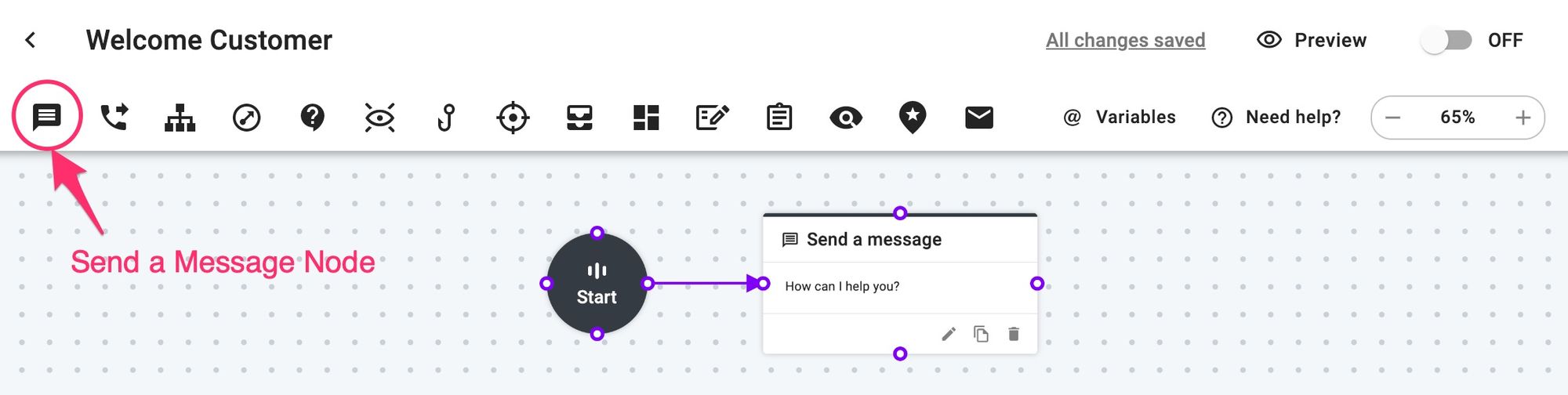
Building a skill is as easy as dragging and dropping nodes, typing in messages, and questions and connecting them with lines. Send a Message node is the basic node for all that enables you to send a message, ask a question, and save the answer.
You can find the node icon at the left end of the node icon bar.
Edit a Message Node
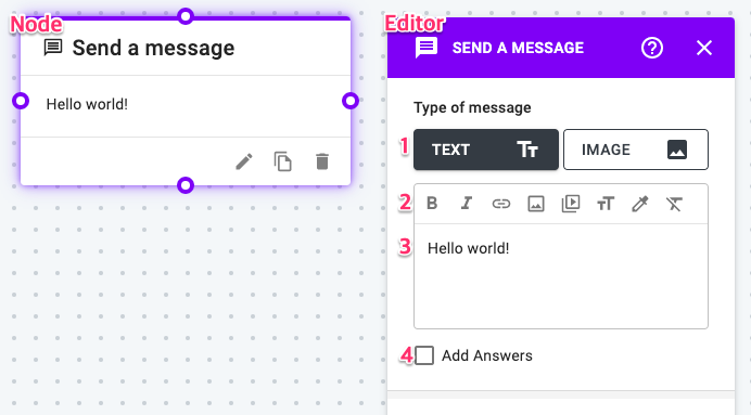
Send a Message node allows you to send text with rich media message or image to your users.
- Text or Image: When you select TEXT message, you can also include formatted text, images (PNG, JPG, GIF), and videos to your users. If you select IMAGE, only an image can be included in the node.
- Below the TEXT and IMAGE selection, you’ll find some buttons:
- Bold: When clicked, bold text will be displayed.
- Italic: When clicked, italic text will be displayed.
- Insert Link: Highlight the text you want to turn into a link and click the Insert Link icon. A small pop-up will show up and you’ll enter the URL and click Submit.
- Insert Image: Click to insert an image. You can upload any JPG, PNG or GIF file from your computer or insert a link of the image in those formats.
- Insert Video: Add a video URL such as YouTube or Vimeo to natively embed a video inside a message node.
- Text Size: Cilck to change size of selected text.
- Text Color: Change color of selected text.
- Clear formatting: Highlight the text you wish to edit and click the Remove Formatting button to reset your text to default settings.
- Enter message: Enter the content of your message.
- Add Answers: Check here to convert the node to Ask a Question node to get an email, address, or any other information from your users. More details are below.
Add Answers - Button
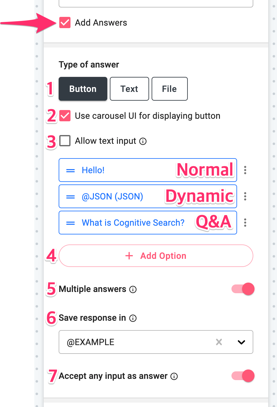
When you enable Add Answers, additional fields will appear below the checkbox.
- Answer type: Answers can be Button option, Text, or File.
- Carousel UI: If checked, the button options will be displayed with carousel UI.
- Allow text input: If checked, users can type in text input instead of selecting a button option, and you can set a separate route upon text input. Multiple answers cannot be turned on if this option is on.
- Add Option: Add Button options for your users to select their answer. You can choose from Normal, Dynamic, Q&A after you click this.
- Normal: A static button option that you can enter the option directly.
- Dynamic: Button options using dynamic variables such as String List, JSON, JSON List. Please check out the List Variables part from this user guide for more details.
- Q&A: You can choose a Q&A question registered under the Knowledge Base > Q&A menu. If a customer select this option, the answer for the Q&A question will be shown before the next node is ran. - Multiple answers: Allows users to select multiple responses.
- Save response in: Save your users’ response in a variable. You can create variables in the Project Settings page or from the dropdown menu here.
- Accept any input as answer: Activate to validate any input using the validation setting of the variable. To understand this feature better, check out these user guides.
- Natural Language Input setting
- String Validation
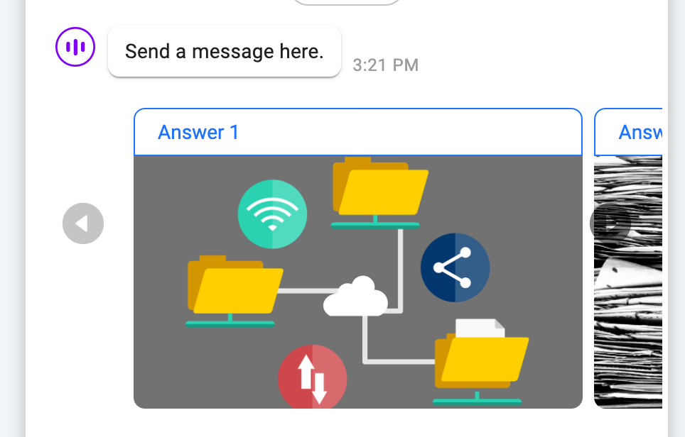
If you choose to see the button options in carousel UI, they'll be displayed as below. You can scroll or click the left / right icon to see other options. In mobile, swipe to do the same.
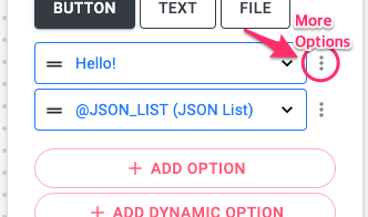
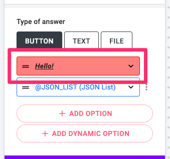
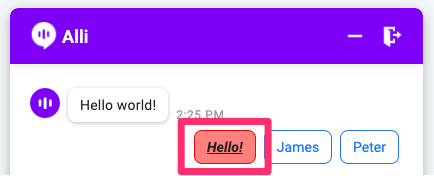
When you click on the more options icon next to the button options, you can change the format of the option or remove the option.
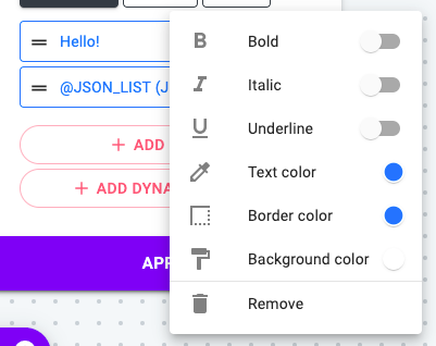
After you change the format of the option, you can check the preview in the node editor. You can highlight specific options using this feature.
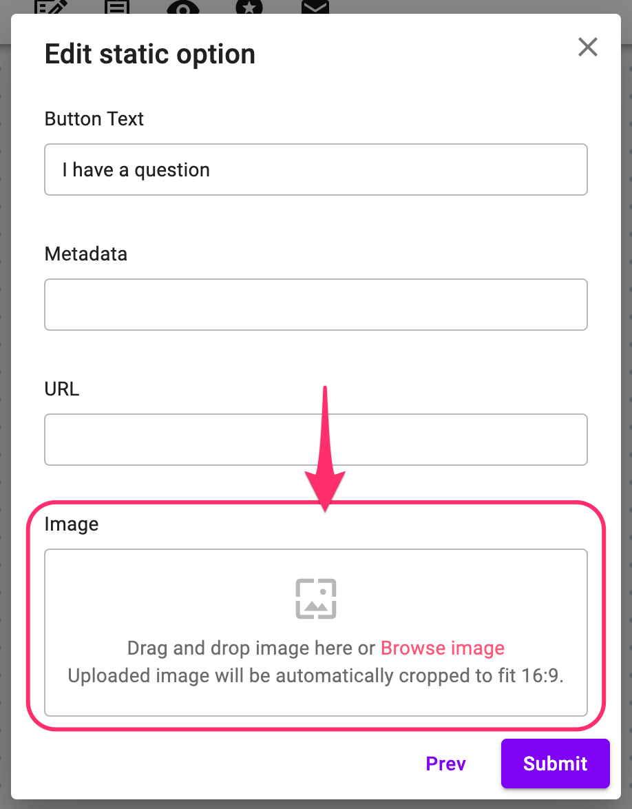
Also, you can add an image to any type of button option. After selecting the option type, simply browse or drag the image to the image field.
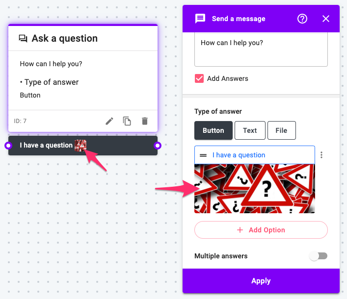
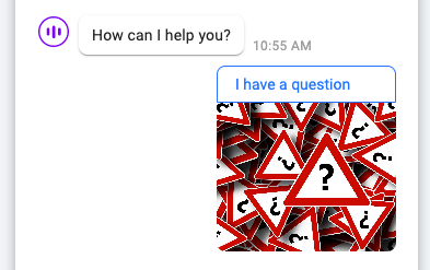
Once the image is added, you can check it on the skill editor. The image is shown to the customers with the label text in the chat and is enlarged when clicked.
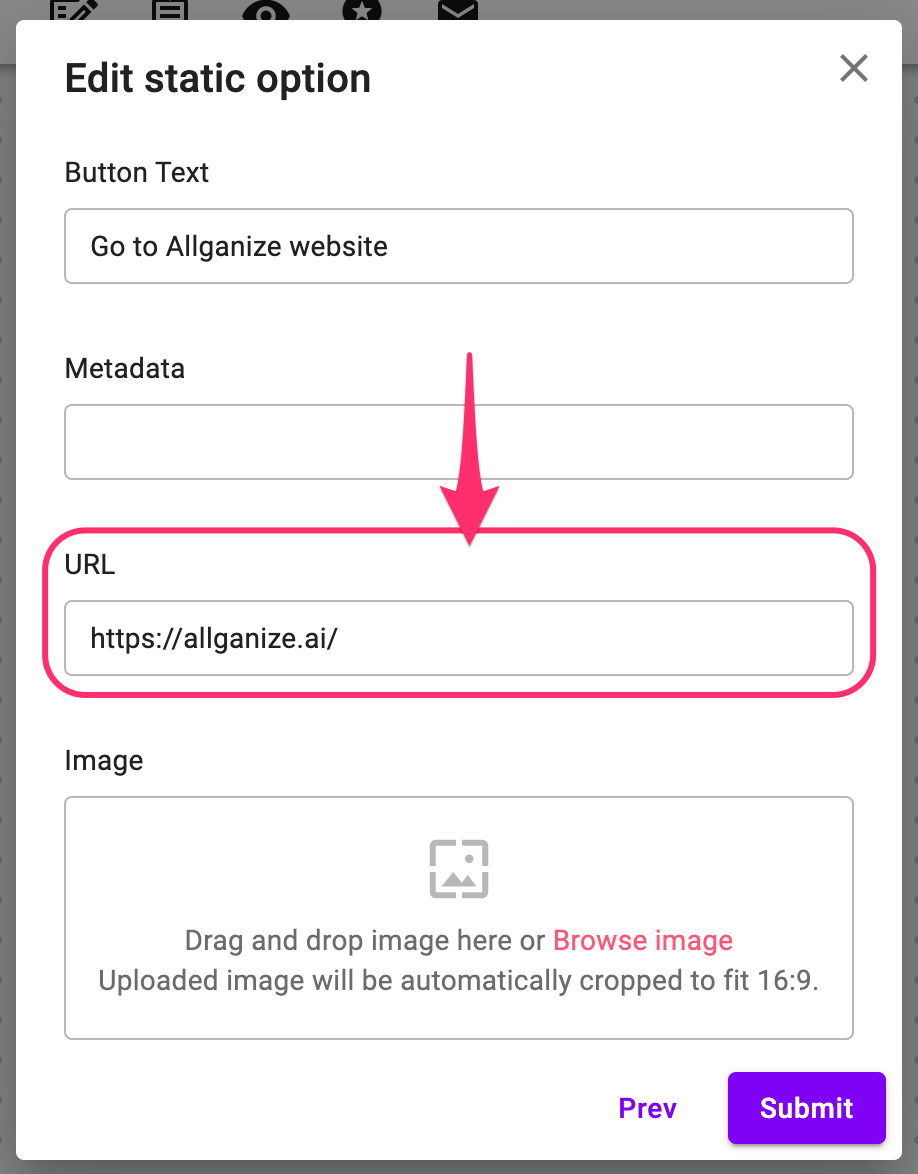
Another thing you can do with the button option is to open a HTML link when it's clicked. To do this, simply add the target URL in the URL field. Any button option types (Normal, Dynamic, and Q&A) support this feature.
Add Answers - Text
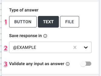
- Answer type: When you select Text, no additional set up is required because the chatflow expects the user to type in their answers to continue.
- Save response in: You can save your users’ response in a variable. You can create variables in the Project Settings page or from the dropdown menu here.
- Validate any input as answer: Check to validate any input using the validation setting of the variable. Please see this user guide for more details about the String validation.
Add Answers - File
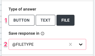
- Answer type: When you select File, no additional set up is required because the chatflow expects the user to upload a file as their answer to continue.
- Save response in: You can save your users’ response in a File type variable. You can create variables in the Project Settings page or from the dropdown menu here.
You can check out this user guide to learn more about File type variable.
Learn More About Allganize's Technology